SPS Elementary School Logos 2023-24

I was doing some research on Seattle Public School PTAs at different elementary schools and happened to notice a wide variety and diversity in logos. I went through each school’s official website (e.g. Thurgood Marshall ES and grabbed the logo on that page. I compiled all the elementary school logos into this image:

Cluster Analysis of World Flags

After spending time looking at world flags, I have started to notice similarities in flags from different countries. Sometimes the similarity may be due to historical relationships, such as the United States of America and Liberia or the United Kingdom and Australia. Other times it may be purely coincidental such as Romania and Chad.

Flag of Romania on left, Flag of Chad on right. Yes, really!

I was interested in determining if additional relationships between flags could be discovered via mathematical analysis of the properties of each flag. To begin my analysis, I needed to find a standardized set of flag image files to make up my dataset. I started by using flags from Wikipedia but found these were too variable in size and image quality. I later ended up purchasing a set of flag image files from CountryFlags. I used the Python library colorgram to scan every pixel of every flag image file and then determine each pixel’s color using the RGB color model. There are many distinct shades of every color so I grouped all shades into groups of red, yellow, blue, green, orange, white and black. For example, the blue of the Argentina flag is quite different from the blue of the Sweden flag, however for the purposes of this project I called them both blue.

Flag of Argentina on left, Flag of Sweden on right

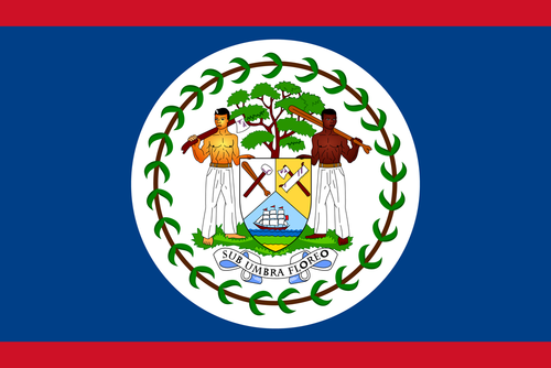
In addition to determining the colors of each flag I was also interested in what percentage of each flag was a specific color. By this method, the flag of France would be represented as 33% red, 33% white and 33% blue. Some country flags have smaller details with distinct colors which made classification trickier. To simplify analysis I limited my dataset to colors that appeared on at least 5% of the overall flag. For example, the flag of Belize has many small details that had to be omitted while retaining the dominant red, blue, and white color pattern.

Flag of Belize

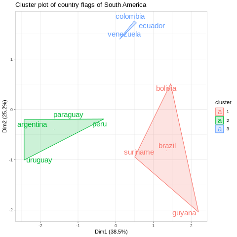
After collecting the data, I implemented a clustering algorithm, specifically K-means clustering which is a mathematical method for grouping observations into clusters. Each cluster contains individual observations with similar values and the smaller the cluster the more similar all of the values are in that particular cluster. For an initial demonstration, I clustered the eleven country flags of South America into three clusters.

From this figure, three clusters of interest are distinctly observed with the smallest cluster consisting of the flags of Colombia, Ecuador, and Venezuela. We can see the other two clusters which have grouped the remaining flags of South America into two separate and larger clusters. From a historical perspective, this makes sense as most countries in South America were colonized by Spain or Brazil and became independent at approximately the same time.

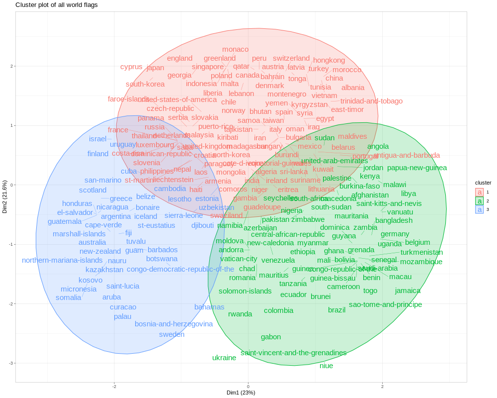
For the analysis of all the flags of the world, I again set the number of clusters to 3 in order to simplify the visual output:

Unsurprisingly, there is quite a bit of overlap between the three clusters and it is difficult to ascertain how these clusters are distinct from each other. Most countries use good design patterns (For example the NAVA guide), similar colors, and similar color proportions for their flags. However, there are some interesting observations and unexpected pairings that reveal themselves after studying the figure. For example, Lesotho and Uzbekistan have similar design patterns as well as similar color profiles. Another interesting pairng that does not share similar design patterns is Honduras and Greece. Also interesting to note how similar many of these flags are, with the two notable outliers being Ukraine and Niue.

Flag of Niue

Cluster analysis is by no means definitive and is typically performed as more of an exploratory analysis. Regardless, I found this method a rewarding way to reconsider the design patterns of the many flags of the world.

As always, analysis code can be found on GitHub

Pair Programming With a 13 Month Old

Pair Programming is a software development method that uses two programmers on one workstation thereby writing code as a team. I did a slight variation of this on a recent project with a thirteen month old and had pretty good success.

Pair Programming
Lisamarie Babik, CC BY 2.0 https://creativecommons.org/licenses/by/2.0, via Wikimedia Commons

I used to really like this site GraphTV and was sad when it closed. I later found OMDb API which I used to recreate GraphTV as a command line program on GitHub. But who wants to use a command line program to look things up? I knew it could be much better hosted on its own website which meant improving my JavaScript and a ideally use a JS charting library (I ultimately went with Chart.js). In a past life I wrote a lot of R code and JS often feels incredibly foreign to me for reasons I cannot quite articulate.

These days I spend most of my time with a 13 month old and have pretty limited amounts of time here and there for writing code. I do find that when working on a programming problem that it can be incredibly easy for me to run into a roadblock, hop on SO and then find myself further out in the weeds and really frustrated.

With this project, I took a different approach. Any time I ran into a roadblock I did a quick search on SO, read a few answers and then just closed my laptop and walked away. Granted this was not the fastest way to solve the problem but it did lead to many minor epiphanies in otherwise quotidian parenting events:

  • Playing with some books on the floor and thinking “The innerHTML() element is not flushing everything out, maybe there is a dedicated function in Chartjs”.
  • Trying to get the 13 month old to eat more and thinking “Why am I using this unwieldy CSV file when I could simplify my code so much with a JSON object”.
  • Changing a diaper and thinking “Well, I have tried everything else, did Bootstrap change something between v4.5 and 5.0?”

I finally finished my project and launched bingetrendy! I am not nor will ever be a shredding programmer and I am okay with that. I also realize that not everyone might have their own 13 month old to help distract them. However, I strongly feel that walking away from my code for extended periods of time was beneficial for me and may be beneficial for you as well. Now if you will excuse me, the 13 month old is asleep and I want to figure out what episodes of It’s Always Sunny in Philadelphia Season 6 I should watch.

Have Any Cities Had a Team in the Championship Game for the Four Major Professional Sports?

The Tampa Bay Buccaneers are set to play in (and host!) the Super Bowl becoming the third professional sports team from the City of Tampa to go to a championship game within a year. Tampa does not currently have an NBA team so they cannot be represented in all four championship games of the major professional sports leagues. However, Miami does have an NBA team and also played in the 2020 NBA finals so a pretty good year for professional sports in the State of Florida. Naturally, this made me wonder if any state has ever had a team in all four championship games in a calendar year. In 1980 Pennysylvania accomplished exactly this:

League Team Outcome
NFL Pittsburgh Steelers Defeated LA Rams 31-19
MLB Philadelphia Phillies   Defeated KC Royals 4-2
NBA Philadelphia 76ers Lost to LA Lakers 4-2
NHL Philadelphia Flyers Lost to NY Islanders 4-2

1980 must have been a great year to live in the Keystone State!

Obviously not every state has a team in all four of the major sports leagues but when did each state last have a team play in a championship game? Here are all states with a championship game drought lasting longer than ten years:

Year State
1991 Minnesota  
1992 Oregon
1998 Utah
2009 Arizona
2010 Indiana
2010 Louisiana
2011 Wisconsin

I wrote all my analysis code and put it in a repo here. Finally all of this talk of 1980s sports made me think of one of the greatest music videos ever:

The Great Influenza Review

NB: I initally wrote this with the goal of submitting to SlateStarCodex however things are on hold with that site so I thought I would just post here instead.

As I get older, I find that I am less willing to tolerate bad books. In the past, out of a strange sense of guilt, I would force myself to keep reading books even though I did not enjoy them. Nowadays, if I am starting to get bored with a book I will stop reading as early as possible and move on to other books. The Great Influenza by John M. Berry challenged this mantra immensely.

This was a book I had heard quite a bit about over the past few years and had long been interested in reading it. I have a background in public health, attended Johns Hopkins University and I wanted to learn more about influenza outbreaks - all of which made me excited to finally sit down and read this book.

This book starts off by making two compelling arguments - the first is that the US medical education system was incredibly weak in 1918 and most medical doctors had no real expertise or training upon graduation and the second argument is that the outbreak began at an army camp in Kansas. Both of these arguments are methodically presented with extensive background by the author. About halfway through the book, as the influenza epidemic continues to grow larger, the author abandons both of these arguments and shifts to more of a focus on how different communities and the US Government responded to the outbreak. The author argues that the Johns Hopkins School of Medicine was intented to improve medical education in the US and was based on the medical education system in German Universities. Many of the early founders of the Johns Hopkins School of Medicine are extensively profiled, only to completely disappear from the book entirely over the course of the book. This is not uncommon, many individuals are introduced, given a thorough background and then never mentioned again.

In the Afterword, the author says he had hoped this book would take only 1-2 years to complete and it ended up taking him seven years to complete. This is evident as there are many examples of the author describing events and people in excessive detail only for the event or person never to never be mentioned again. For example “Cincinnati’s public health agencies had examined 7,058 influenza victims since the epidemic had ended and found that 5,264 needed some medical assistance; 643 of them had heart problems, and an extraordinary number of prominent citizens who had influenza had died suddenly early in 1919.” (p. 392) This is the first time in the book that Cincinnati is mentioned in the book and it is unclear what exactly these statistical counts add to the narrative as Cincinnati is never mentioned again.

This book is sorely in need of an editor to prune some of the superfluous text. For example:

“It also seemed - although this was not scientifically established - that those who went to bed the earliest, stayed there the longest, and had the best care survived at the highest rates. Those findings meant of course that the poor died in larger numbers than the rich.” (p. 408)

Some basic run on sentences:

“Ten days, two weeks, sometimes even longer than two weeks after the initial attack by the virus, after victims had felt better, after recovery had seemed to begin, victims were suddenly getting seriously ill again. And they were dying.” (p. 317)

Reading page after page of this is exhausting.

This is not to say the book is all bad. There are some interesting parallels between today and the 1918 outbreak that are worth exploring. For example in 1918, President Wilson did not mention the outbreak at all in public and very rarely if at all in private with his staff. The US Surgeon General at the time, Rupert Blue, was extremely slow to even ask for influenza infection counts and instead focused on extolling patriotism by the virtues of Liberty Loans. In Phoenix and Philadelphia, “Citizens Committees” were created by private citizen groups who took it upon themselves to act to enforce quarantine and sanitation ordinances.

Finally, I was cautiously optimistic about the Afterword, written ten years after publication in 2018, and I hoped it would be a breath of fresh air. Sadly it is not. The author rants in the Afterword by claiming that wearing face masks is useless and that the only thing that might get society through a similar epidemic is belief in our elected leaders.

In many ways, reading this book is like performing a science experiment in the sense that there is an interesting story present but to get to it one must sift through a great deal of noise. The book as a whole was moderately interesting but far, far too long. For additional background I would also suggest reading the excellent Wikipedia page about the 1918 Flu instead.

The First Book of the Year Is Always a Biography

For the past few years I have tried to start each New Year off by selecting a biography as the first book I read that particular year. I have no specific methodology as to why I choose the biographies I do, often it is from something tangential to the topic of the biography or just because I am interested in the topic in general. Here are some of my recent picks as well as my pick for 2020:

2016 - Elon Musk: Tesla, SpaceX, and the Quest for a Fantastic Future

I picked up this one largely because I was interested in Elon Musk and curious to learn more about him. This book was illuminating in regards to how much self-confidence Musk has in himself and how much he was willing to double down on himself and how frequently that was all he needed to move on to more stable ground.

2017 - Spread Spectrum

I was interested in reading more about Hedy Lamarr and this book seemed like a great place to start. It was self-published and quite bizarre at times but it did explain technical details quite well and was well-paced which more than made up for the author’s unconventional asides.

2018 - The Man Who Fed the World: Nobel Peace Prize Laureate Norman Borlaug and His Battle to End World Hunger

I was really interested in learning more about Borlaug and his contributions to agronomy but this particular biography was sloppy and rife with colloquialisms. Borlaug was a fascinating character who likely saved billions of people from starvation and demands a better biography than this one.

2019 - I Am Dynamite!: A Life of Nietzsche

I did not initially set out to read this book as my first book of the year. Unfortunately, the book I had planned on reading, In the Great Green Room: The Brilliant and Bold Life of Margaret Wise, was so bad that I bailed on it and read the Nietzsche biography instead. Prior to reading, I was aware of Nietzsche if only because of the famous “God is dead” quote and something vaguely related to Nazism. I was fascinated to learn more about him and how his writings were completely reappropriated after his death. This was one of the better books I read all year.

Finally, in 2020 the first book I am reading is Empress Dowager Cixi: The Concubine Who Launched Modern China. Each year I try to alternate between male and female biographies and after bailing on the biography of Margaret Wise last year, I felt it was time to read a female biography to start 2020. I am also quite interested in China and while I realize this book might be quite revisionist am curious to learn more about Cixi and her role in developing modern day China.

Impact of Amazon Echo on Babies Named Alexa

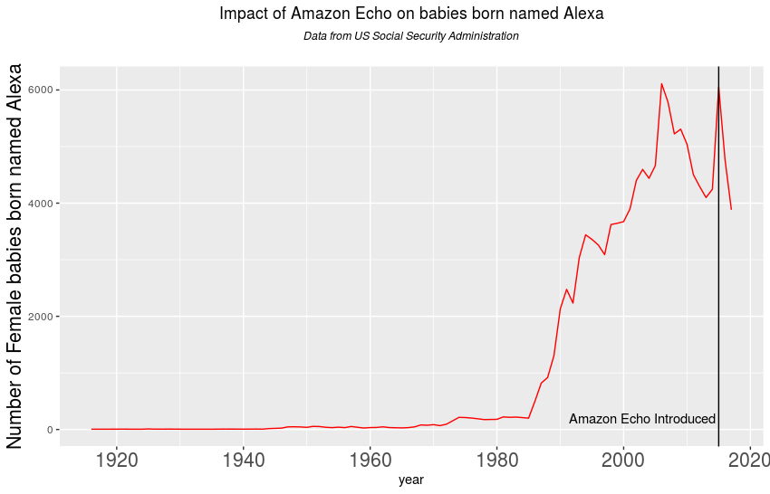
A few years ago, there was an article in the Seattle Times about girls named Alexa post-introduction of the Amazon Echo. I was chatting with a friend of mine about this and we wondered if the introduction of the Amazon Echo has lead to a reduction in girls named Alexa. According to Wikipedia, the Amazon Echo was first introduced on November 6, 2014 and Hadley Wickham was kind enough to organize an R package of baby names as recorded by the United States SSA. Using this data shows a steep decline in the number of female babies named Alexa which may be due to a variety of factors:

In the process of making this first plot I realized that there are boys in the SSA data named Alexa as well, lets see what the data for boys looks like:

What Is the Most Remote Airport From the City It Serves in the United States?

Recently, there was a question on travel.SE about locating the airport furthest from the city it is supposed to serve. There are some interesing answers including the winner from Paris where the airport is approximately 147 km away from the Paris metro area. I started to wonder about this question for different airports within the US and I stumbled onto this Wikipedia page which served as a good baseline for a quick analysis.

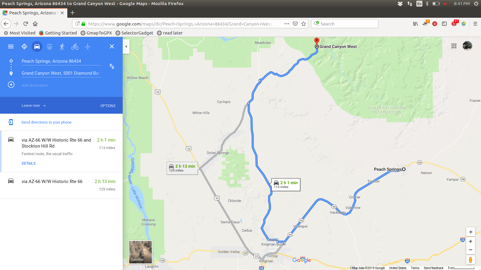
I used the Google Maps location API to calculate latitude and longitude for the center of the town or city and location of the airport. I then used the Google Maps directions API to calculate the driving distance between the airport and the center of the town it serves. This lead to some interesting edge cases. For example, Peach Springs, Arizona is on this list and the airport is about 113 miles away:

Peach Springs is a Census Designated Place and largely serves the Hualapai tribe. Should it have been included on this list?

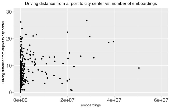
I also noticed on this Wikipedia page that there are many airports with split locations (Sea/Tac Airport for example) or a single airport serving multiple locations such as Harrisburg International Airport serving Harrisburg/Middletown, PA). For these cases I just used the first city mentioned for this analysis. The Wikipedia article also lists enplanements as recorded by the FAA in 2015 which provides a useful metric for comparison. First I looked at distance to airport versus number of passengers:

Not too surprising to observe that many of the airports have very few emboardings each year and are reasonably close to the center of town.

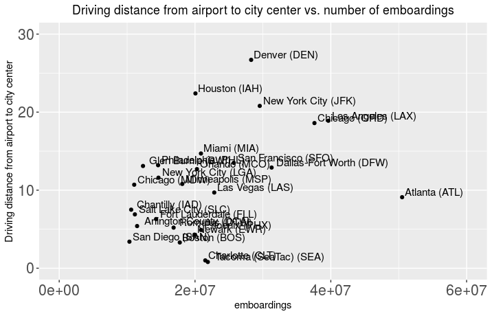
Then I looked at only airports that had over one million enplanements which narrowed my list of airports down to 27:

To me it is interesting to note that San Diego, Boston and to some extent Dulles are all close to the city center with relatively few emboardings as compared to this subset. Also, I grew up in Fort Collins, CO and have many fond memories as a child of driving across the plains with Denver International Airport seeming so, so far away.

As always, full code available on GitHub

Changes in Voter Turnout Between the 2014 and 2018 US Elections

As I watched the livestream of the 2018 US midterm election results, I was absolutely stunned at the significant increase in voter turnout over the 2014 US midterm election. Now that almost all of the 2018 election results have been certified by their repective Secretaries of State, I wanted to take a look at how this increase in voter turnout manifested on a state by state basis.

To make things as simple as I could, I primarily used the data from two New York Times elections pages: the 2014 results page and the 2018 results page.

I realize this data may not be complete as some of the voter counts are not fully reported for all precincts on these pages. However, the total vote count from the 2014 data is 72,031,124 while the total vote count from 2018 is 106,385,810 which I felt was accurate enough for the purposes of this analysis.

In both elections, I primarily focused on the House of Representatives because that was the only office for universally up for election. As I embarked on this project I soon realized that a direct comparison would not be possible after Pennslyvania re-drew its congressional maps in early 2018 and Florida did so as well in a 2016 redistricting.

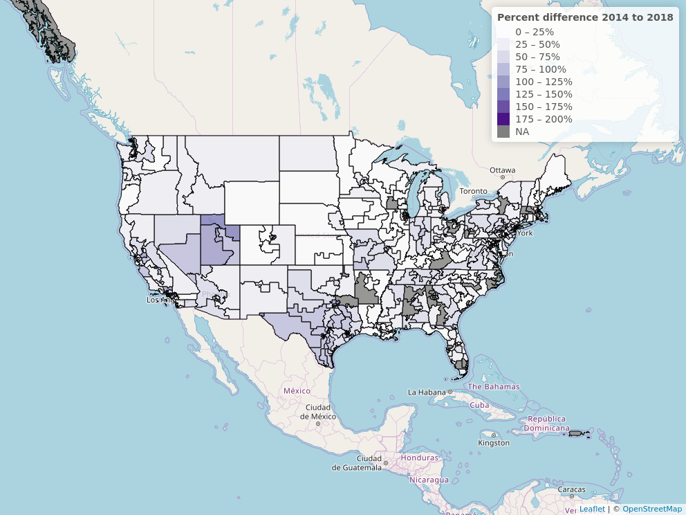
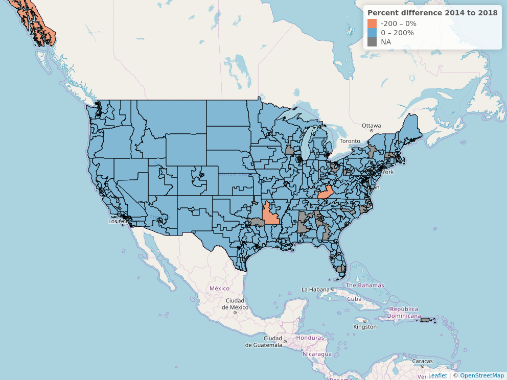
This first map simply shows congressional districts where the voter turnout increased. The congressional districts colored grey have either a decline in voter turnout, or where the candidate ran uncontested in either 2014 or 2018 (or both) and therefore do not have a difference in percentage to measure.

Explorable version here

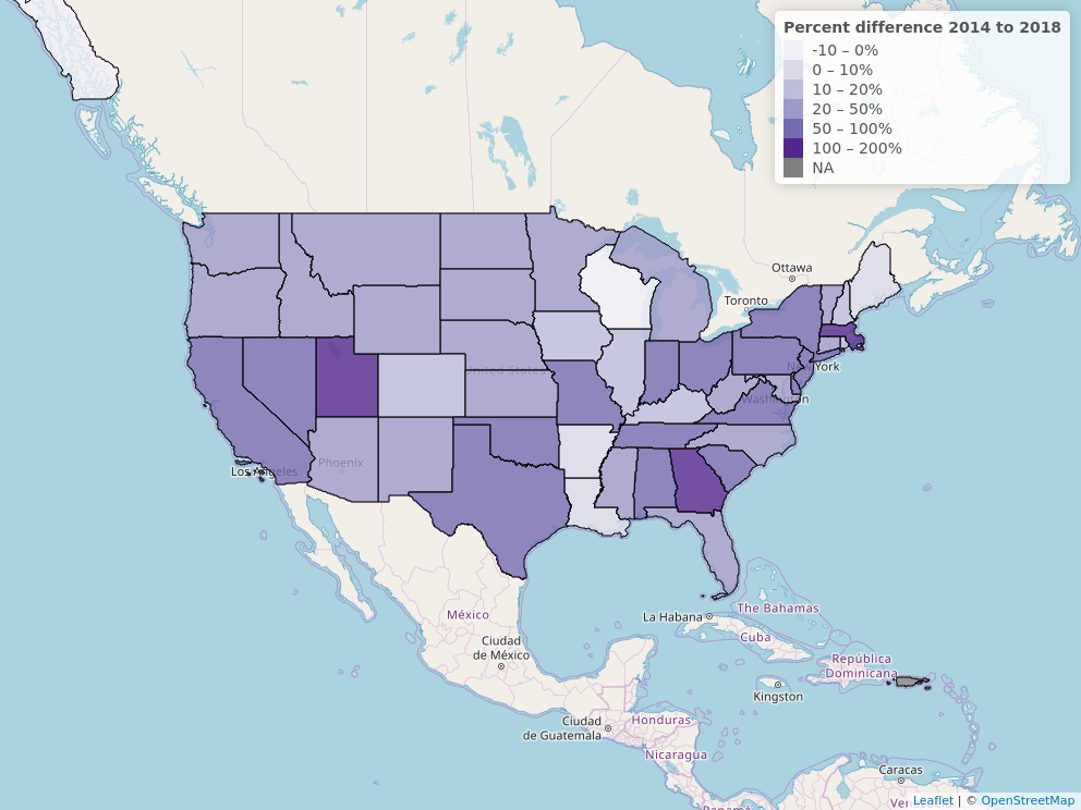
The second choropleth map shows states that increased in voter turnout as blue, states that decreased in voter turnout as red while those colored grey had at least one uncontested election.

Explorable version of this map here

It is interesting to note that only seven US Congressional districts had decreases in voter turnout from 2014 to 2018. Table of districts with decreased voter turnout:

District 2014 votes 2018 votes Difference
IL-09 203946 91476 -55.14
CO-01 266021 256542 -3.56
PA-02 202635 197495 -2.53
AK-00 242844 238131 -1.94
IL-07 171502 170290 -0.70
AR-04 205066 204113 -0.46
KY-05 218697 218324 -0.17

The district with the highest increase in turnout? That would be CA-34

Finally I grouped all the votes together by state to make the following choropleth of US House votes on a state level:

Explorable version of this map here

A Visual Comparison of Votes for Two Carbon Tax Initiatives

Washington State voters were presented two different carbon tax initiatives in the General Elections of 2016 and 2018. A full comparison of both proposals is here. While neither passed, I was curious how the Yes vote looked for both Initiatives.

Map of percentage of Yes votes for Initiative 732 (General Election 2016), hover mouse cursor over county for exact Yes percentage.

Map of percentage of Yes votes for Initiative 1631 (General Election 2018), hover mouse cursor over county for exact Yes percentage.

Overall net change in Yes votes from Initiative 732 to Initiative 1631 as a percentage of the whole by county. The more red counties are where Initiative 732 was favored more while the more blue counties are where Initiative 1631 was favored more. Hover mouse cursor over county for net difference between Yes votes for both initiatives.